Nitro Software, Inc. wanted to add free conversion tools to their website to attract new customers, provide product value for its users, and remain competitive in the market. Nitro owned multiple external sites that provided this exact feature, so this project would also allow the company to sunset these sites.
I was responsible for UX design, designing the product element as system components and completing the web page layout through close collaboration with Brand and Marketing.
key collaborators
brian shamblen, emma herlick, mona brahmbhatt, carla gould, dave gregor, alex acker, leslie gilliam, david stanley

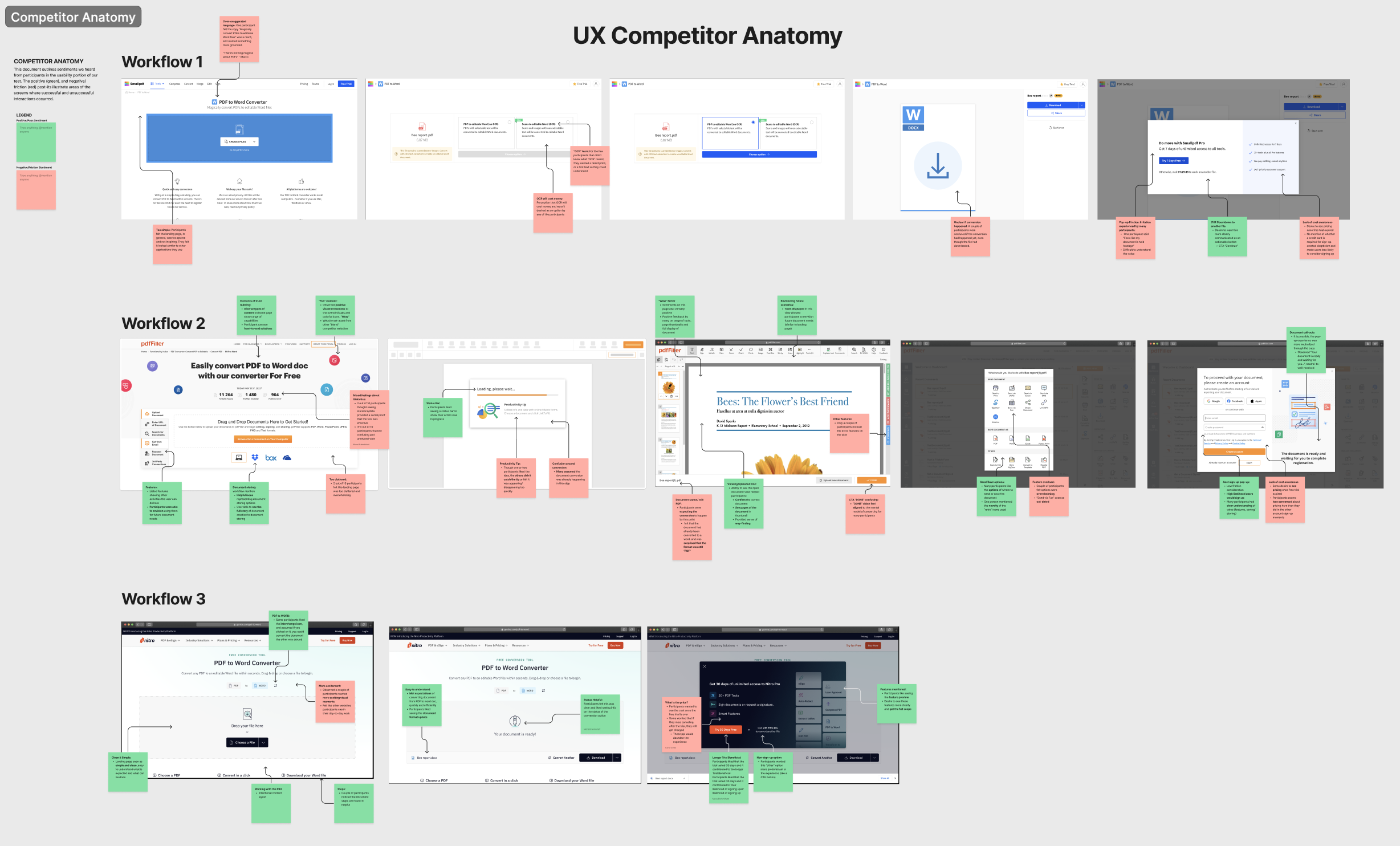
The team wanted to move fast to put together a prototype to test in a research study. I did a UX audit of existing competitor web apps as well as within Nitro. I took note of existing patterns, language, and functionality. It was important to be aware of expectations in the market to remain competitive.
UX audit of competitor web apps

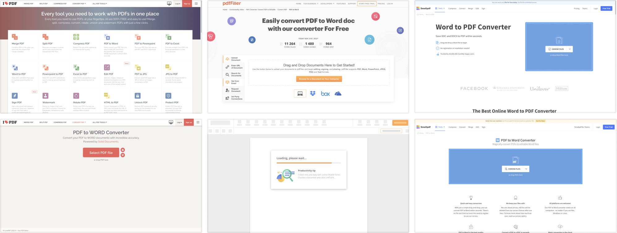
UX audit of Nitro conversion tools

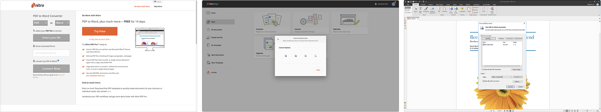
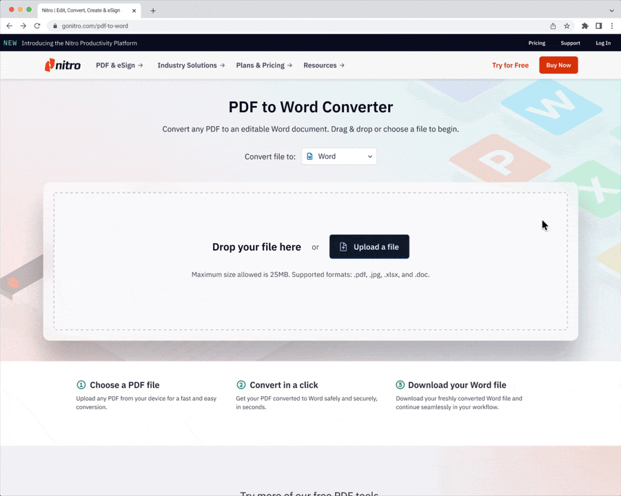
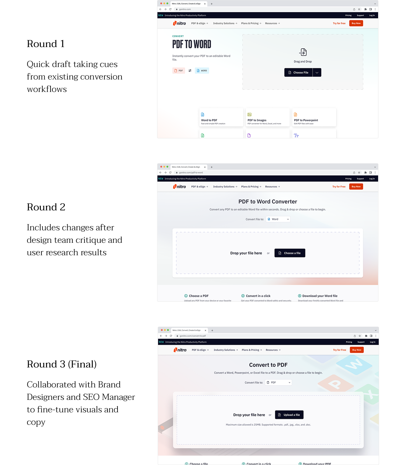
I put together an end-to-end document conversion experience and hosted critiques with the design team during the iteration process. Once I was confident I had captured all the necessary elements for a complete experience, I provided a prototype for Research Operations to conduct research and user testing.
Snapshot of critique board

We wanted to conduct user research to understand who would be interested in free online tools. Our Research Operations team facilitated interviews with 10 participants who the team defined as “basic users" that had a desire for light PDF editing functionality and a low appetite for product expenses.
Some questions we were seeking to answer:
Feedback from the interviews was insightful and allowed us to paint a picture of who these users are, what their needs were, and how Nitro could fit into their document workflow.
"Basic User" personas

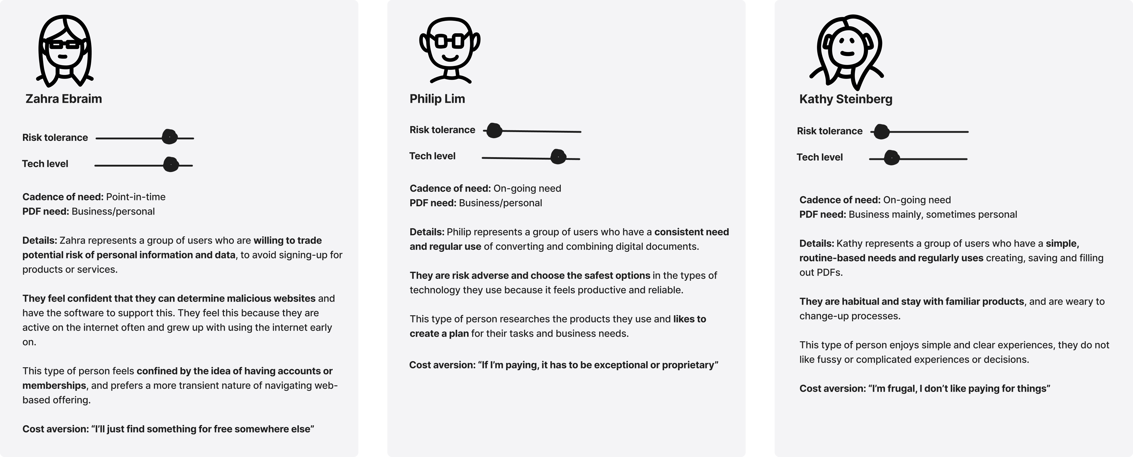
During the interview, we had users walk through 3 conversion tool experiences, one of them being the basic prototype I had created from the initial rounds of design. The feedback gave us strong signals on what was working and what could be improved on.

Key UI takeaways
Initially, the team wanted to push users to convert to paying customers.
Taking cues from existing apps, the original strategy was to limit conversions to once a day. The hypothesis was that users would eventually sign up for an account to unlock unlimited conversions. However, the research findings clearly showed that users were extremely adverse to signing up and already had immediate negative reactions to a pop-up at the end of the flow.
Considering that we did not want to risk user drop-off, the team decided to stay focused on the intention to increase brand awareness and website traffic. Getting users to convert to paying customers remained a secondary priority. We removed as many points of friction as possible to optimize a positive and reliable experience for this new user group.
After adjusting the product strategy in accordance with research findings, I applied design changes. While the main flow and functionality did not change, layout and component usage was updated. Nailing the visual elements and copy to set the tone and optimize the brand impression was also very important. I collaborated closely with our Brand Designers and SEO experts to accomplish this.


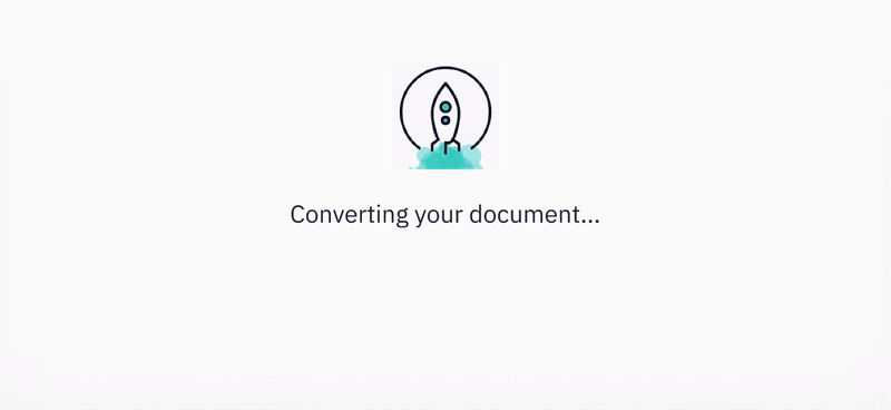
This project introduced new UX patterns such as a drag and drop component and loading animations. I collaborated with our brand designers, UX designers, and engineers to brainstorm and design these elements. These details were important to the tone and sophistication of the product, and our choices would affect the grander product system.

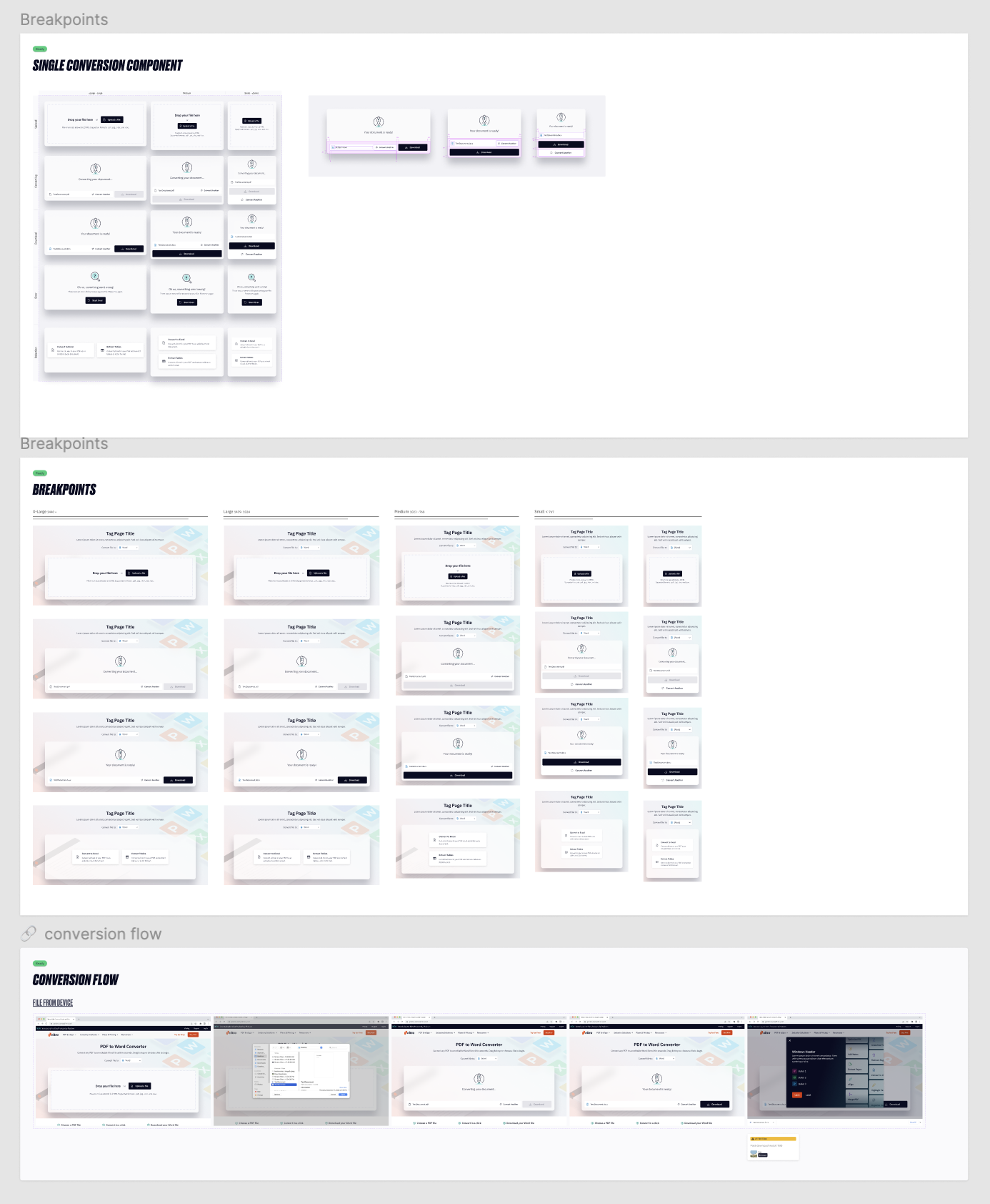
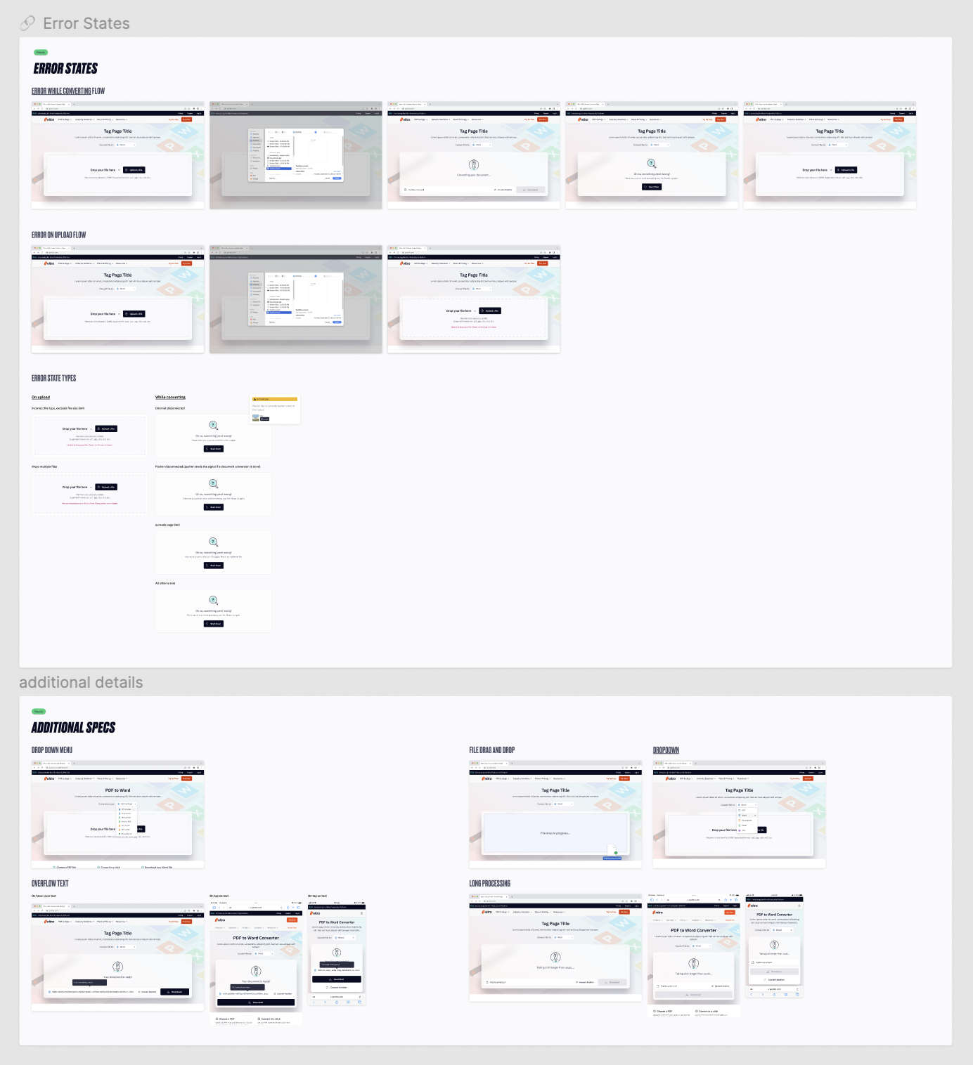
Once designs were adjusted based on research findings, I was responsible for laying out specs for the end-to-end experience as per breakpoints, error states, and OS or device specifications.
Working in step with engineering, we made sure small reusable elements such as a button, drop down menu, or drag and drop field were first built into the design system before being used in this project. This pushed forward progress in our design system and ensured the product would be scalable after its initial release.
Close-up of design specs

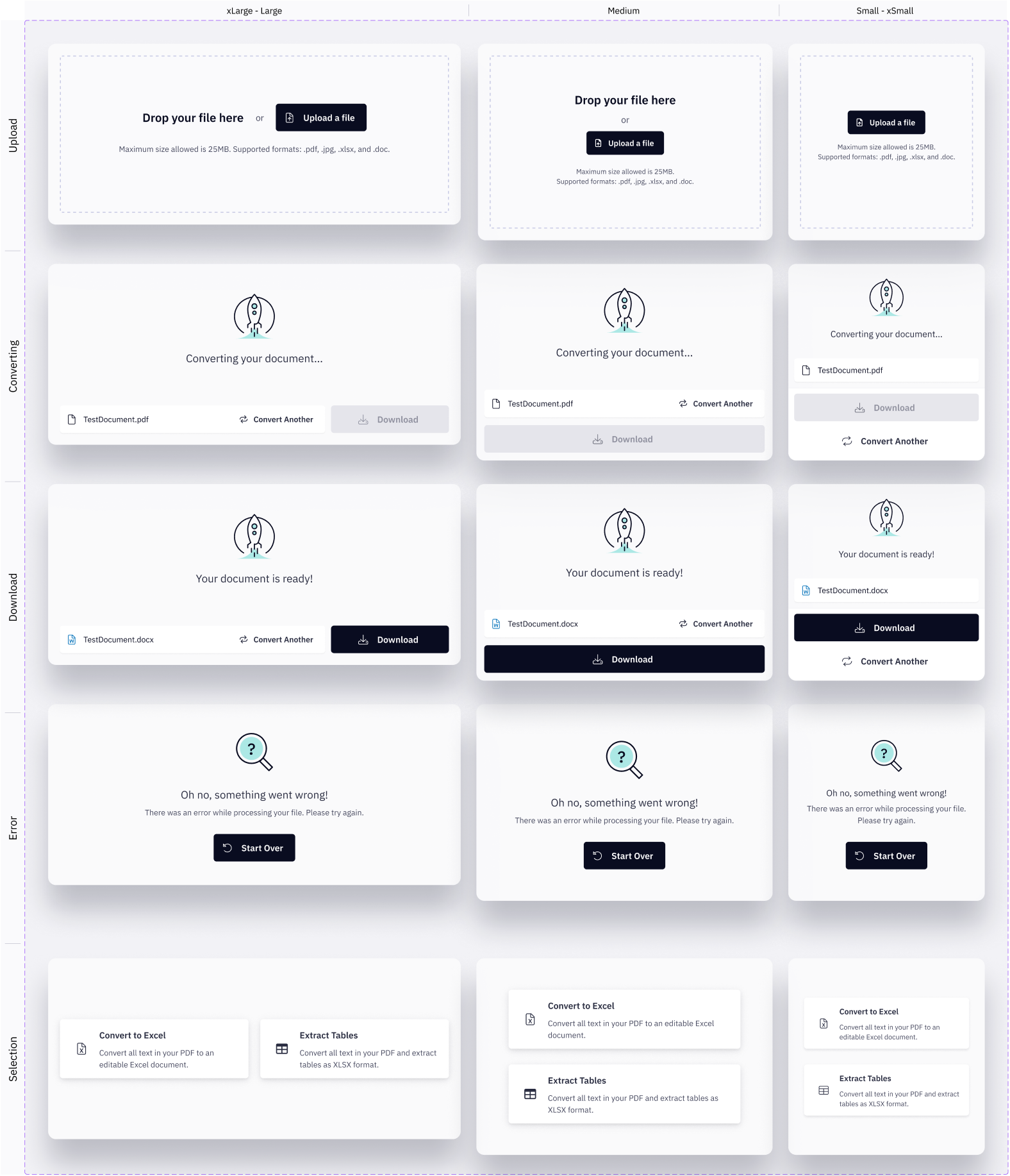
Birds-eye view of design specs


Lastly, I detailed out the webpage, including content layout and the post-download experience. Content was managed by Marketing while the structure and functionality were executed by Design and Product & Engineering.

Our team set up data tracking to monitor the impact of the product release. Data points included: document file upload success, conversion start success, conversion success, document download CTA clicked, and start trial CTA clicked. The team also tracked the top 20 keywords relevant to document conversion and the website traffic growth both year over year and month over month.
This project was a major collaboration across teams, especially led by Marketing, Product & Engineering, and Design. While the initial product release was highly anticipated within the company, the work did not stop there and the tool continues to be improved upon to ensure its quality as well as its reach to potential customers.