Initial Designs
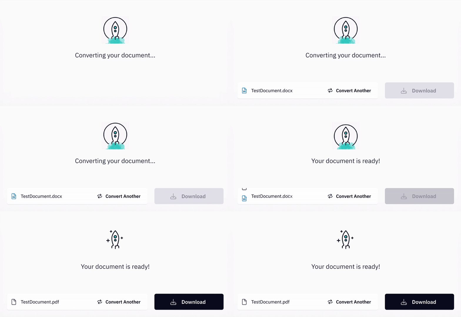
Utilizing existing website UX patterns and competitor analysis, I put together an end-to-end document conversion experience. I hosted critiques with the design team during my iteration process until we were confident as a team it included the necessary elements for a complete experience. I created a basic prototype for Research Operations to conduct research and user testing.
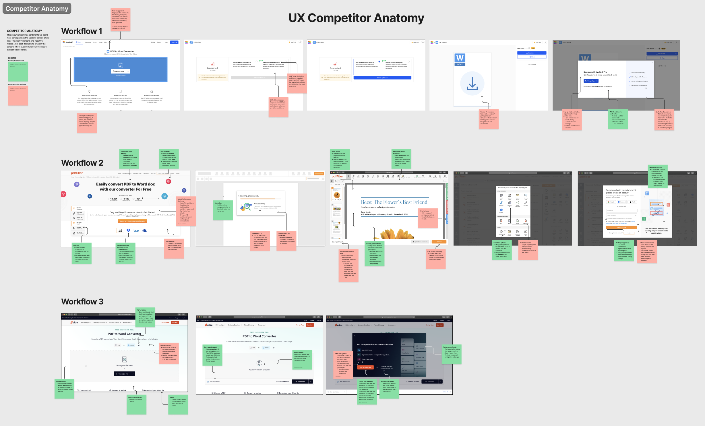
Snapshot of critique board

This experience introduced new UX patterns such as a drop box component and loading/processing animations. I collaborated with our brand designers, UX designers, and engineers to brainstorm and design these elements. We were aware that choices we made for this would affect other experiences in the grander product system. We also believed that these details were important to the tone and sophistication of the experience.
Research
We wanted to understand users who are interested in free online tools. We conducted interviews with 10 participants who we defined as “basic users” that had a desire for light PDF editing functionality and a low appetite for product expenses.
Some questions we were seeking to answer:
- What are their basic product needs?
- What about an experience, such as functionality or branding, is appealing to users?
- Do they have any brand loyalties?
- What are their concerns such as cost or security?
- What does their document workflow look like?
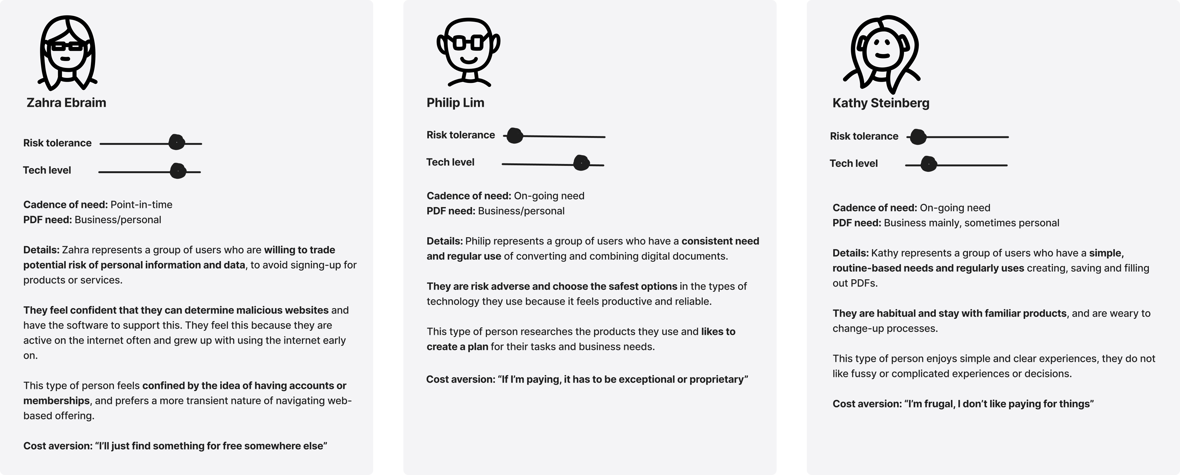
Research Operations synthesized the results into takeaways and user personas and shared out to the larger team.
"Basic User" personas

During the interview, we had users walk through 3 conversion tool experiences, one of them being a basic Nitro prototype. The UX feedback gave us strong signals on what was working and what could be improved on.
Production
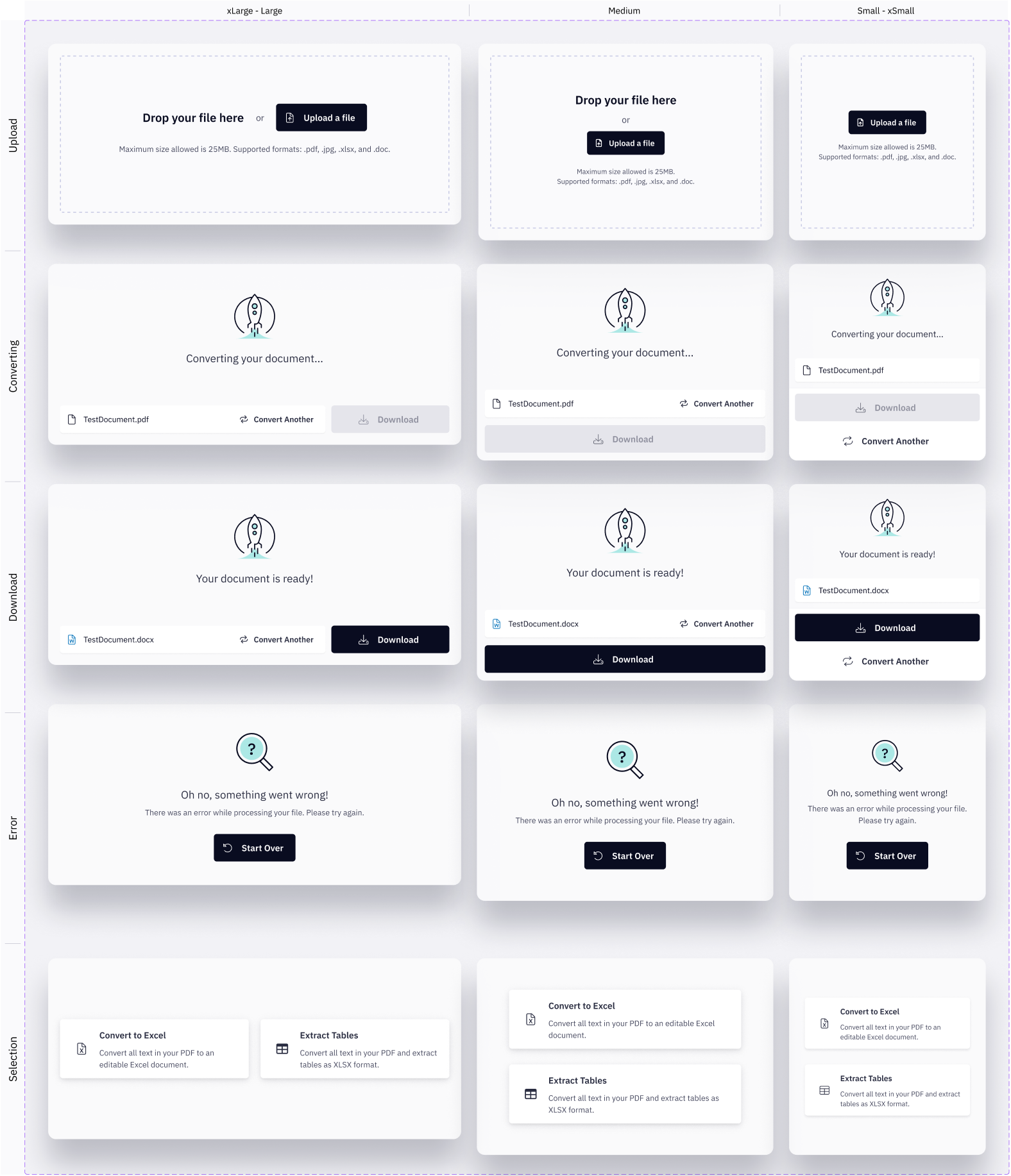
Once designs were adjusted based on research findings and further iteration, I was responsible for laying out designs for the end-to-end experience as per breakpoints, error states, and OS or device specifications.
Working directly with engineering to build the product component, we ensured that any smaller common elements such as a button, drop down menu, or drop box were first built into the design system before being used in this project. I detailed out specs at each level of component complexity.

I also detailed out the webpage, including content layout and the post-download experience. Content was managed by Marketing while the structure and functionality were executed by Design and Product & Engineering.

Release
Data tracking was set up so that our teams could monitor the impact of the product release. Data points included: document file upload success, conversion start success, conversion success, document download CTA clicked, and start trial CTA clicked. The team also tracked the top 20 keywords relevant to document conversion and the website traffic growth both year over year and month over month.
This project was a major collaboration across teams, especially led by Marketing, Product & Engineering, and Design. While the initial product release was highly anticipated within the company, the work did not stop there and the product continues to be improved upon to ensure the quality of the product as well as its reach to potential customers.


