Refreshing visuals
I took stock of the main screens in the application that captured all elements that needed updating. I recreated all these elements in Figma and began swapping out new colors and iconography. During this step in the process, I was building the Nitro PDF Pro for Windows Figma file as well as an iconography library simultaneously.
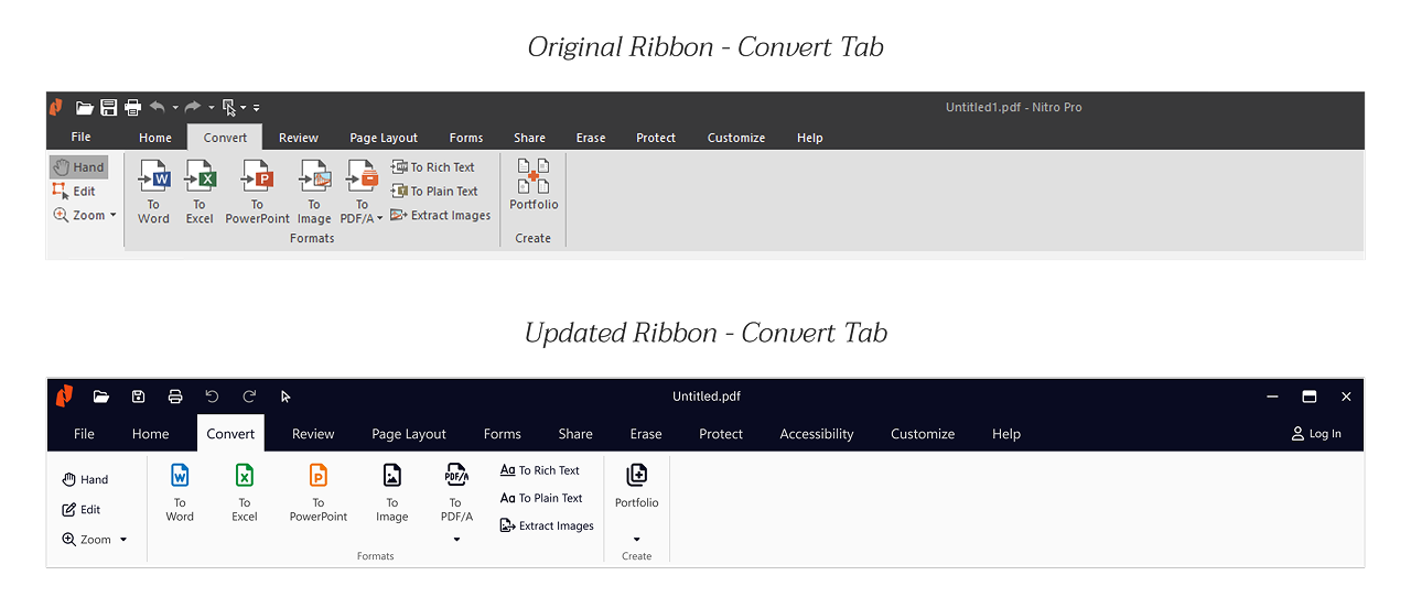
Once I had settled on icons, I worked on placing them in their respective image sprite. Our application used image sprites to display icons, so I needed to create new image sprites to hand off to engineering. Between Product & Engineering and Design, we agreed that the rebrand should work in line with the existing app. Nitro PDF Pro for Windows was a complex application with years of historical code, and we needed to approach any changes with thorough consideration.
Example of icons placed in image sprite
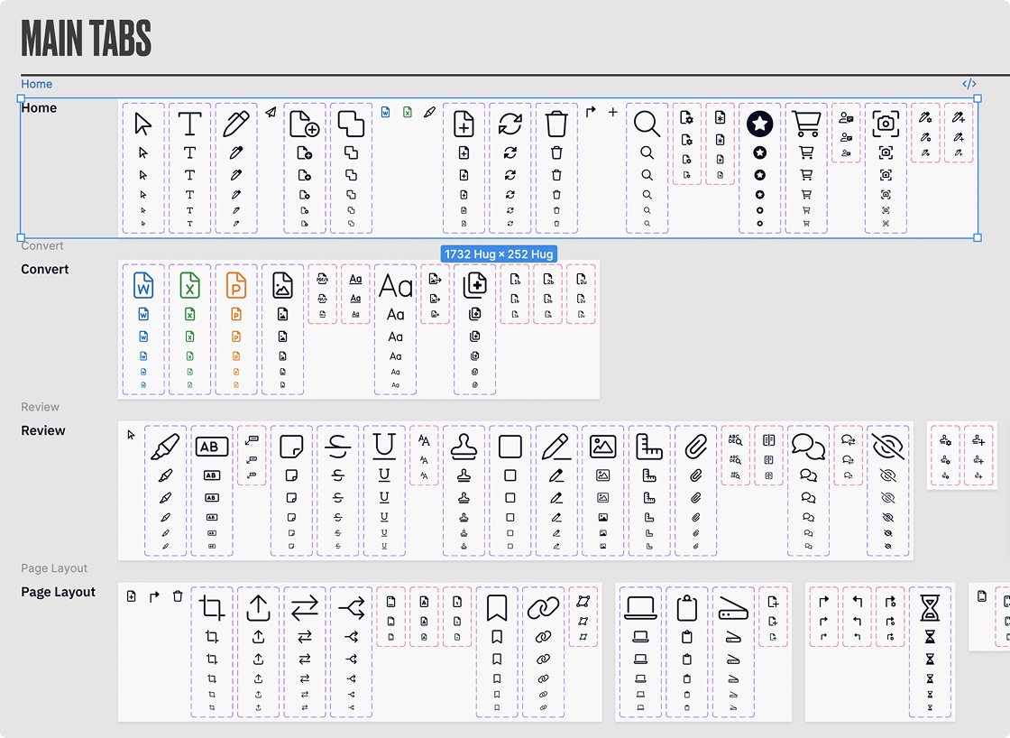
Figma Organization
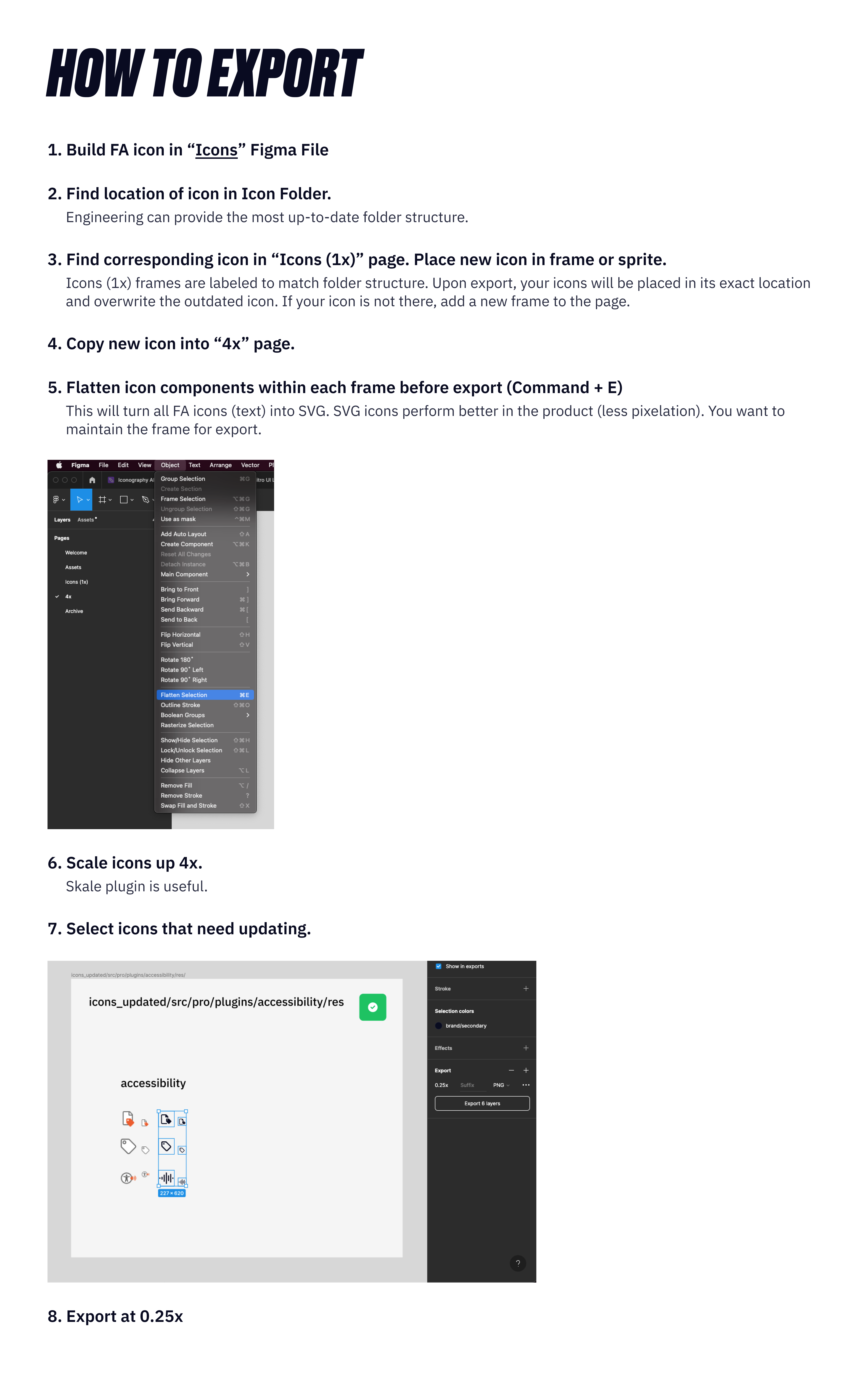
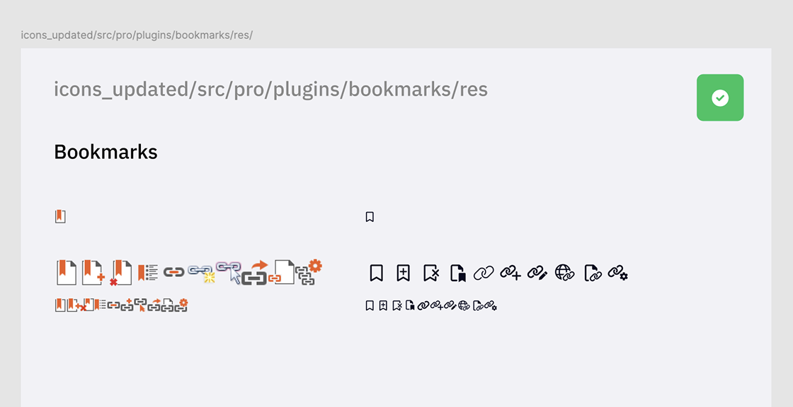
Engineering provided an assets folder with all the images and icons that needed to be updated. In order to efficiently and methodically replace hundreds of desired assets, I organized my Figma file to match this folder structure. This allowed me to export numerous assets at once, which would be placed in the correct location and replace the outdated asset.
This decreased the amount of work and confusion in providing new assets to Engineering. They could replace the folder in the app and all links would remain.
Figma organization that reflects the folder structure
Upon exporting new assets from Figma, we ran into a small snag. Icons were appearing blurry in their exported image. After a quick meeting between design and engineering, we found a solution that required us to upscale the icons to 4x its size before exporting at 0.25x size. This resulted in crisp lines in our icon assets. I documented this process for future exporting.
Icon Exporting Guide